568 search results
(0.015 seconds)
- Hedge Backwards by Comicraft,
$39.00 You begged with us..! You pleaded with us..! But we decided to release the official Richard Starkings font anyway! Yes, I am Richard Starkings and you may remember my hand lettering from such comic books as THE KILLING JOKE, TRANSFORMERS and, um, THE KILLING JOKE! Yes, finally Comicraft is making available the font that started it all -- from the pages of MARVELS, SUPERBOY, GENERATION X and, um... MARVELS! The font that Kurt Busiek, writer/creator of ASTRO CITY, really, really likes but we've always refused to make available to him. Always leave your friends wanting more, that's my motto.
 - TT Backwards by TypeType,
$29.00 TT Backwards useful links: Specimen | Graphic presentation | Customization options About TT Backwards: TT Backwards is an experimental font project inspired by the USSR typography and fonts of the late 70s and early 80s. Shop signs, posters, and book design—this is where we drew the inspiration for our project. TT Backwards consists of two complementary font subfamilies, a Script and a Grotesque, each of them includes 5 typefaces in 5 different weights (Thin, Light, Regular, Bold, Black). TT Backwards Script is a noncontrast almost monolinear solid script inspired by shop signs, poster and book design of the USSR. TT Backwards Script features a large number of Latin and Cyrillic ligatures (more than 70 items), which allows to make the script versatile and sophisticated to the max. And thanks to the implementation of a huge number of context alternates, all lowercase letters are joined softly and without breaks, and they meet the uppercase letters beautifully and correctly. TT Backwards Script supports the following OpenType features: liga, case, ordn, frac, sups, sinf, numr, dnom, tnum, onum, pnum. TT Backwards Sans is a narrow grotesque, which takes us back to the book design of late 70s and early 80s with its ductile characters. It is created considering its use in the small text size. TT Backwards Sans has a number of pronounced peculiarities: high x-height, exaggerated extenders, and big visual compensators and ink traps. Apart from the basic visual solution, TT Backwards Sans contains two experimental stylistic sets, which markedly change the overall visual perception of the text. SS01 alters high-frequency symbols of the Cyrillic alphabet, and SS02 significantly changes the high-frequency symbols of the Latin alphabet. FOLLOW US: Instagram | Facebook | Website TT Backwards OpenType features: case, ordn, frac, sups, sinf, numr, dnom, tnum, pnum, liga, zero, salt, ss01, ss02. TT Backwards language support: Acehnese, Afar, Albanian, Alsatian, Aragonese, Arumanian, Asu, Aymara, Banjar, Basque, Belarusian (cyr), Bemba, Bena, Betawi, Bislama, Boholano, Bosnian (cyr), Bosnian (lat), Breton, Bulgarian (cyr), Cebuano, Chamorro, Chiga, Colognian, Cornish, Corsican, Cree, Croatian, Czech, Danish, Embu, English, Erzya, Estonian, Faroese, Fijian, Filipino, Finnish, French, Friulian, Gaelic, Gagauz (lat), Galician, German, Gusii, Haitian Creole, Hawaiian, Hiri Motu, Hungarian, Icelandic, Ilocano, Indonesian, Innu-aimun, Interlingua, Irish, Italian, Javanese, Judaeo-Spanish, Judaeo-Spanish, Kalenjin, Karachay-Balkar (lat), Karaim (lat), Karakalpak (lat), Kashubian, Khasi, Khvarshi, Kinyarwanda, Kirundi, Kongo, Kumyk, Kurdish (lat), Ladin, Latvian, Laz, Leonese, Lithuanian, Luganda, Luo, Luxembourgish, Luyia, Macedonian, Machame, Makhuwa-Meetto, Makonde, Malay, Manx, Maori, Mauritian Creole, Minangkabau, Moldavian (lat), Montenegrin (lat), Mordvin-moksha, Morisyen, Nahuatl, Nauruan, Ndebele, Nias, Nogai, Norwegian, Nyankole, Occitan, Oromo, Palauan, Polish, Portuguese, Quechua, Rheto-Romance, Rohingya, Romanian, Romansh, Rombo, Rundi, Russian, Rusyn, Rwa, Salar, Samburu, Samoan, Sango, Sangu, Scots, Sena, Serbian (cyr), Serbian (lat), Seychellois Creole, Shambala, Shona, Slovak, Slovenian, Soga, Somali, Sorbian, Sotho, Spanish, Sundanese, Swahili, Swazi, Swedish, Swiss German, Swiss German, Tagalog, Tahitian, Taita, Tatar, Tetum, Tok Pisin, Tongan, Tsonga, Tswana, Turkish, Turkmen (lat), Ukrainian, Uyghur, Vepsian, Volapük, Võro, Vunjo, Xhosa, Zaza, Zulu.
 - Backhand by Scratch Design,
$10.00 Introducing Backhand! It's a modern script font with texture brushed ink style. It's highly recommended for you who want to make some designs with texture in font style. This font will work for invitation design, logos, badge design, poster, packaging, book cover title, quote, social media post, etc. Just open your Opentype features while using the script font to use the ligatures and swashes. Also, this font includes alternates for uppercase and lowercase characteristics. Features: Accents (Multilingual characters) Ligatures Swashes Numerals Punctuations So, enjoy the Backhand script and make some cool stuff!
 - Quiet Backyard by Invasi Studio,
$13.00 Quiet Backyard is a super playful combo pairing font. Combination with the concept rounded sans serif and hand-lettered font. From Fun, Playful handwriting and casual rounded san serif. This attractive combination with playful vibes special for your Display Design; is guaranteed to add an eye-catching suitable for your logo designs, brand imagery, quotes, product packaging, merchandise & social media posts. ?Features: Alternates Punctuation Ligature Multi-language
 - Backyard Bouquet by Rachel White Art,
$16.00 Backyard Bouquet is a breezy hand-lettered caps font. Mix and match caps and lowercase letters to create a hand-lettered look in your designs.
 - Backyard Hero by Hanoded,
$15.00 Judging the amount of superhero series, I thought it was time for a superhero-font. Meet Backyard Hero - your friendly neighbourhood good guy. He will fight off aliens and criminal masterminds, help old ladies across the street and give your designs an unexpectedly good look!
 - Special K - 100% free

- Special K - Unknown license

- special k. - Unknown license

- Department K - Unknown license

- K-Block by HiH,
$10.00 K-Block was inspired by a hand-lettered sign by a young lady by the name of Kristina Lee. It captures a light-hearted, youthful feeling and is not intended to be taken too seriously. It was drawn for fun and is fun to use. Its very inconsistency insists on being casual and relaxed. Probably better for a birthday party announcement than a bank letterhead. Can you imagine a Just-For-Fun National Bank? K-Block Solid compliments K-Block and provides a stronger presence when required. For two-color work, K-Block can be layered on top of K-Block Solid to provide a different color outline for a very effective presentation. Full Western European character set plus alternate g and y, as well as a Th ligature. If you have a drawing program like Corel Draw, you can easily convert the alternate g and y to curves and stretch out the tails to underline an entire word. The zip package of each font includes two versions. There is an OTF version which is in Open PS (Post Script Type 1) format and a TTF version which is in Open TT (True Type)format. Use whichever works best for your applications. K-Block and K-Block Solid are sold separately.
 - Backwash AOE by Astigmatic,
$19.00 Backwash AOE is a typeface I drew up back in 2000 inspired by various graffiti artists. Coming across all of my sketches recently and seeing a trend lately in graffiti inspired styles, I finally came around to finishing it up digitally for release. I love the break the rules, wildchild aspect, of graffiti lettering. And while this typeface is nothing like the wilder inspirations that I spawned this typeface from, it has a more legible direction to it, retaining just the flavor of the originals. I hope you enjoy it.
 - ITC Backyard Beasties by ITC,
$29.00 - The Backyard Script by Figuree Studio,
$18.00 The Backyard Script is a bold script font, inspired by a Retro aesthetic. Made in combination with hand lettering, it comes with dramatic movement and it’s great for any next creative project that needs retro or vintage vibes It is ideal for logos, handwritten quotes, product packaging, header, poster, merchandise, social media & greeting cards. Features Basic Latin A-Z and a-z Numbers Symbols Stylistic Alternate Stylistic Set (001 – 015) Swash PUA Encode Multilanguage Support To enable the OpenType Stylistic alternates, you need a program that supports OpenType features such as Adobe Illustrator CS, Adobe Indesign & CorelDraw X6-X7. There are additional ways to access alternates, using Character Map (Windows), Nexus Font (Windows), Font Book (Mac), or a software program such as PopChar (for Windows and Mac).
 - Packard Antique - Personal use only

- Socially Awkward - Unknown license

- K haus 105 by Talbot Type,
$19.50 K-haus 105 is inspired by the work of graphic designer and typographer, Herbert Bayer, during his time at the Bauhaus around 100 years ago — work that kick-started graphic design as we know it, to this day. It owes something to the simple geometry of Bayer’s hand-drawn, ‘universal typeface’, updated and expanded to deliver a clean, balanced, geometric sans for today. Also available as K-haus 205 , featuring a few, more 'daring' characters here and there, chiefly in the lower case set. Both variations include an extended character set, featuring accented characters for Central European languages.
 - Josef K Paneuropean by Juliasys,
$38.95 With the Josef K *, Julia Sysmäläinen continues her artistic debate on Franz Kafka’s writing style. This time the designer of FF Mister K is not drawn to Kafka’s literary works created at night but to those the writer produced at daytime as a high-ranking, confident bureaucrat – Dr Franz Kafka. The typefaces Josef K “Paneuropean” and “Strong European” echoe Kafka’s prestigious status at the Workmen’s Accident Insurance Institute of the Austro-Hungarian Empire. Their ductus, originating from a broad-nibbed ink pen combines a clear, self-confident stroke with the calligraphic features so typical for Franz Kafka’s handwriting. While both typefaces are more straightforward and bolder than the wonderfully erratic fonts of the FF Mister K family Josef K Paneuropean is best characterized as a semibold handwriting textface. Josef K Strong European, Sysmäläinen’s latest “K”-accomplishment, provides an ideal complement to it as a distinctly bold display face – great for headlines, product names and branding. It combines perfectly not only with Josef K Paneuropean but also with all the FF Mister K textfaces. Both Josef K Paneuropean and Josef K Strong European have Western, Central European and Extended Cyrillic character sets. With more than 2500 glyphs they support over 100 languages. *Kafka’s persona Josef K is a leading bank officer – reminiscent of the author himself – in the novel The Trial.
 - Josef K Patterns by Juliasys,
$9.60 Franz Kafka’s manuscripts have always been a source of inspiration for designer Julia Sysmäläinen. At first she was just interested in literary aspects but later she noticed that content and visual form can not be separated in the work of this ingenious writer. Analyzing Kafka’s handwriting at the Berlin National Library, Julia was inspired to design the typeface FF Mister – by now a well known classic. Over the years, FF Mister K became a handsome typeface family and even produced offspring: the Josef K Patterns. Some of Kafka’s most expressive letterforms were the starting point for these decorative ornaments. How do the Patterns work? Outlines and fillings correspond to the uppercase and the lowercase letters on your keyboard. You can use them separately or layer them on top of each other. If you write a line of “pattern-text” in lowercase and repeat it underneath in uppercase you get a row of fillings followed by a row of outlines. Now you can color them and then set line space = 0 to get a single line of layered colored ornaments. Alternatively, activating OpenType / stylistic set / stylistic alternates will also unite the two lines to a single layered line. Further magic can be done with OpenType / contextual alternates turned on. On the gallery page of this font family is a downloadable Josef K Patterns.pdf with an alphabetical overview of forms. Hundreds of patterns are possible … we’d love to see some of yours and present them here on the website!
 - K haus 205 by Talbot Type,
$19.50 K-haus 205 is inspired by the work of graphic designer and typographer, Herbert Bayer, during his time at the Bauhaus around 100 years ago — work that kick-started graphic design as we know it, to this day. It owes something to the simple geometry of Bayer’s hand-drawn, ‘universal typeface’, updated and expanded to deliver a clean, balanced, geometric sans for today. Also available as K-haus 105 , featuring a few different characters here and there, chiefly in the lower case set. Both variations include an extended character set, featuring accented characters for Central European languages.
 - K&T Sasha by K and T,
$70.00 This clean looking (all caps) font has characters made of gaps, which form the stencil divisions, spaced evenly along the strokes. The letterforms have a well-proportioned constructional appearance. The characters look like they have been built from interlocking bricks, the stencil gaps give them both rhythm and texture. The sans serif typeface also has a sense of movement because of the way the stencil gaps follow the horizontal, vertical or curved direction of the stroke.
 - FF Mister K by FontFont,
$69.99 Finnish type designer Julia Sysmäläinen created this script FontFont inspired by Franz Kafka’s manuscripts in 2008. The family contains several styles and is ideally suited for unique visual identities, festive occasions, music and nightlife as well as software and gaming. FF Mister K provides advanced typographical support with features such as ligatures, alternate characters, case-sensitive forms, fractions, super- and subscript character, and stylistic alternates. This FontFont is a member of the FF Mister K super family, which also includes FF Mister K Dingbats , FF Mister K Informal , and FF Mister K Splendid . Find more information on FF Mister K’s very own Website ffmisterk.com .
 - K&T Heidi by K and T,
$70.00 This is a well-built, functional (all caps) typeface, which is very modern in character. The use of diagonal corners in this angular typeface is inspired by the pennant numbers on British Royal Navy warships, which adds an military quality to this typeface. The gaps, which form the Stencil divisions, follow pre-established horizontal and vertical lines, they help to achieve both geometric and proportional harmony. The direction of the gaps is always at a right angle to the stroke.
 - K&T Martine by K and T,
$70.00 This is an angular typeface inspired by axonometric construction diagrams (for flat-pack furniture), particularly the way their lines impart a sense of 3-D space. The horizontal, vertical, and diagonal constraints of stroke direction produce interesting results in characters such as the 'R', 'S', and 'V' and contribute the mechanical appearance of this typeface. There is a high degree of repetition amongst different characters (upper and lower case) for instance the ’M’ and ‘W’ are similar and so are the ’m’ and ‘w’.
 - Packard Patrician NF by Nick's Fonts,
$10.00Here’s a new take on the hand-lettered alphabet Oswald Bruce Cooper used in ads for the Packard Motor Company, later converted into a metal typeface by the Barnhard Brothers & Spindler foundry. This version has smoother outlines and an increased x-height, but retains all of the elegant charm of the original. Both versions of this font include the complete Unicode Latin 1252 and Central European 1250 character sets. - Awkward Gothic JNL by Jeff Levine,
$29.00Awkward Gothic JNL gets its name from the fact that it's a non-conformist alphabet - as if rendered by hand by a school child or an amateur lettering artist. Although there is a relative symmetry to most of the letter forms, some unconventional widths and the shape of many of its characters adds to the hand-made look of this alphabet. - Packard New Style by Red Rooster Collection,
$60.00 Steve Jackaman & Ashley Muir. Packard New Style is a smooth version of the lettering drawn by Oswald Cooper for the Packard Motor Company (ATF 1913). The bold weight is credited to Morris Fuller Benton (ATF 1916), but it is highly probable that Benton did the adaptation for both weights. Packard New Style Pro contains all the high-end features expected in a quality OpenType Pro font.
 - Packard Old Style by Red Rooster Collection,
$60.00 Steve Jackaman & Ashley Muir. Packard Old Style is based on lettering drawn by Oswald Cooper for the Packard Motor Company (ATF 1913). The bold weight is credited to Morris Fuller Benton (ATF 1916), but it is highly probable that Benton did the adaptation for both weights. Packard Old Style Pro contains all the high-end features expected in a quality OpenType Pro font.
 - Ass - Unknown license

- Maye Calistial by Maulana Creative,
$13.00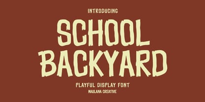 School Backyard playful display font. Regular stroke, fun character with a bit of ligatures and alternates. To give you an extra creative work. School Backyard font support multilingual more than 100+ language. This font is good for logo design, Social media, Movie Titles, Books Titles, a short text even a long text letter and good for your secondary text font with script or serif. Make a stunning work with School Backyard font. Cheers, Maulana Creative
 - High German by Grummedia,
$20.00Based on examples of common medieval Gothic typefaces, High German has lots of character, giving an immediate impression of the densely packed pages of the 'traditional' backward looking printers of the day. - kankana - Unknown license

- XPawnShop by Ingrimayne Type,
$5.00 XPawnShop is a typographical chess font; the pieces are letters. The Pawn is an awkward letter P, the knight is a horse in the shape of an h, the bishop is a decorative letter B, the rook is an elephant with an R shape, the queen is a Q, and the king is an ornate K. Two other XPawnShop fonts are made of very simple pieces, but as a bonus, both have the set of dominoes from the unicode block 1F030 to 1F093. The key layout is a bit complicated; see the key guide for detailed information on how to position pieces correctly.
 - ALS Fuchsia by Art. Lebedev Studio,
$63.00 Fuchsia is a soft, romantic, and slightly eclectic script. The characters feature wide proportions, high contrast, and backward bends at joints—all ensuring the typeface truly shine in large sizes. Complex capitals look very nice next to lowercase letters.
 - Club - Personal use only

- Kato - Unknown license

- Waverley - Unknown license

- Anna - Unknown license

- Greetings - Unknown license

- Digitalis - Unknown license


Page 1 of 15Next page